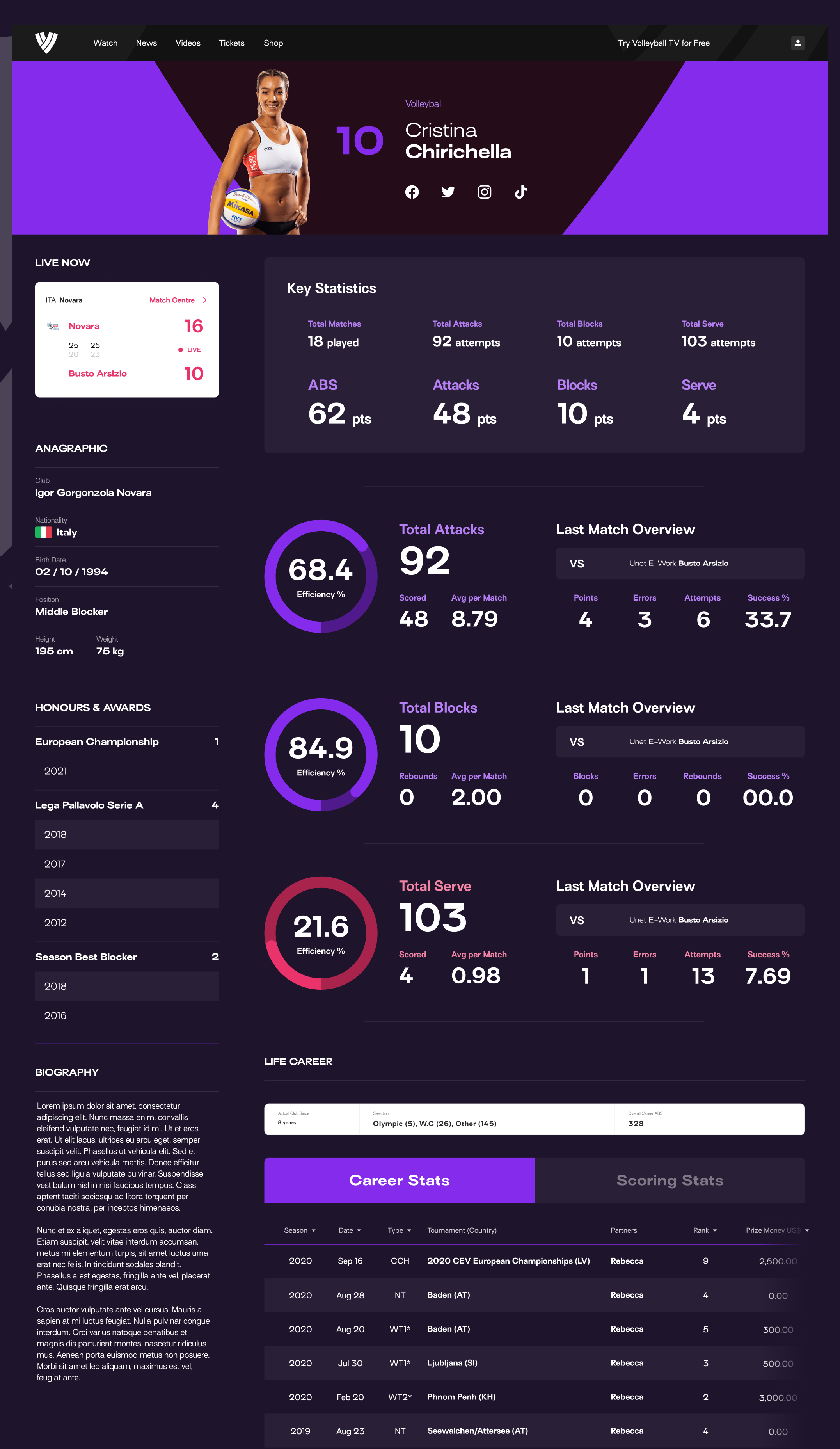
Volleyball World
Project Type - Website & App Launch and Optimisation
MVP Launch - March 2022
Project Duration - 3+ years
My Role:
Design Lead

Aims & Objectives
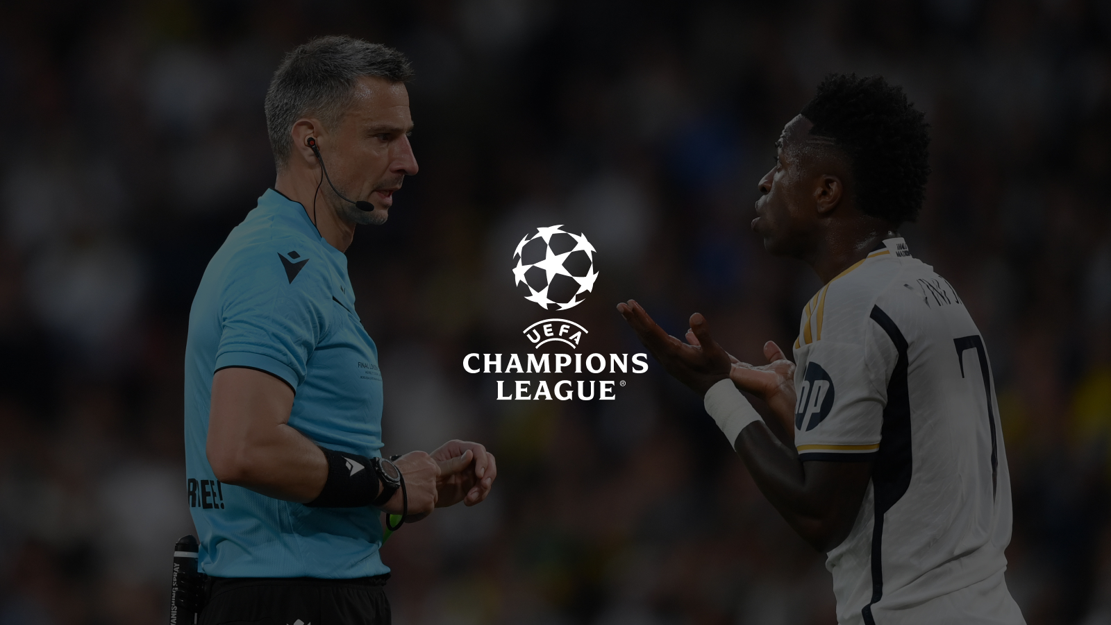
Volleyball is one of the most popular sports in the world, with an estimated 900 million fans across Brazil, USA, Russia, Italy, Japan and China and more. The professional game’s governing body is the FIVB who oversee leagues and tournaments across 3 disciplines - indoor, beach and snow volleyball.
The FIVB web property was suffering from an identity crisis - presenting a mix of rules and board meeting minutes alongside fixtures, results, and news. It wasn’t attractive for fans and didn’t inspire new players to get into the game. Tournament and Leagues all had their own microsites with varying IA and design patterns.
They hired Deltatre to create web and app properties for Volleyball World, with the aim to do the following
- Bring all tournament and league data back into one place.
- Offer users a personalised experience by signing up for it fan passport, which would make the site more attractive to advertisers as it collects data from its global fanbases.
- Promote and capture fan signups for Volleyball TV streaming service.
- Beat their competitors to become the source of truth for stats, rankings, scheduling, and athlete data
My Role
Design Lead - I was responsible for the overall design vision, planning and delivery. I managed the design team remotely across Europe and Australia, produced the UX design assets, facilitated workshops, lead reviews with designers. tech teams, and stakeholders.
Key Challenges
Increase signups for Fan Passport
Optimise funnel for Volleyball TV
Merging competition microsites into main site
The Result in Numbers
18k+
new fans signed up for Fan Passport accounts in the first 12 months
32%
increase in digital ad and sponsorship revenue after 24 months
14%
increase in TV subscription revenue in first 12 weeks of optimisation
Design Gallery
Key Challenge
Increasing VBTV Subscriptions
During a strategy workshop in Switzerland, we worked alongside Volleyball World’s marketing team, product owner, and our development team to assess Volleyball World's first 6 months of performance post-launch, and define a data-informed roadmap for the year ahead. As part of this process, the client identified increasing paid subscriptions to Volleyball TV (VBTV) as a key challenge to address.
Key Challenge - Increasing VBTV Subscriptions
Our Approach
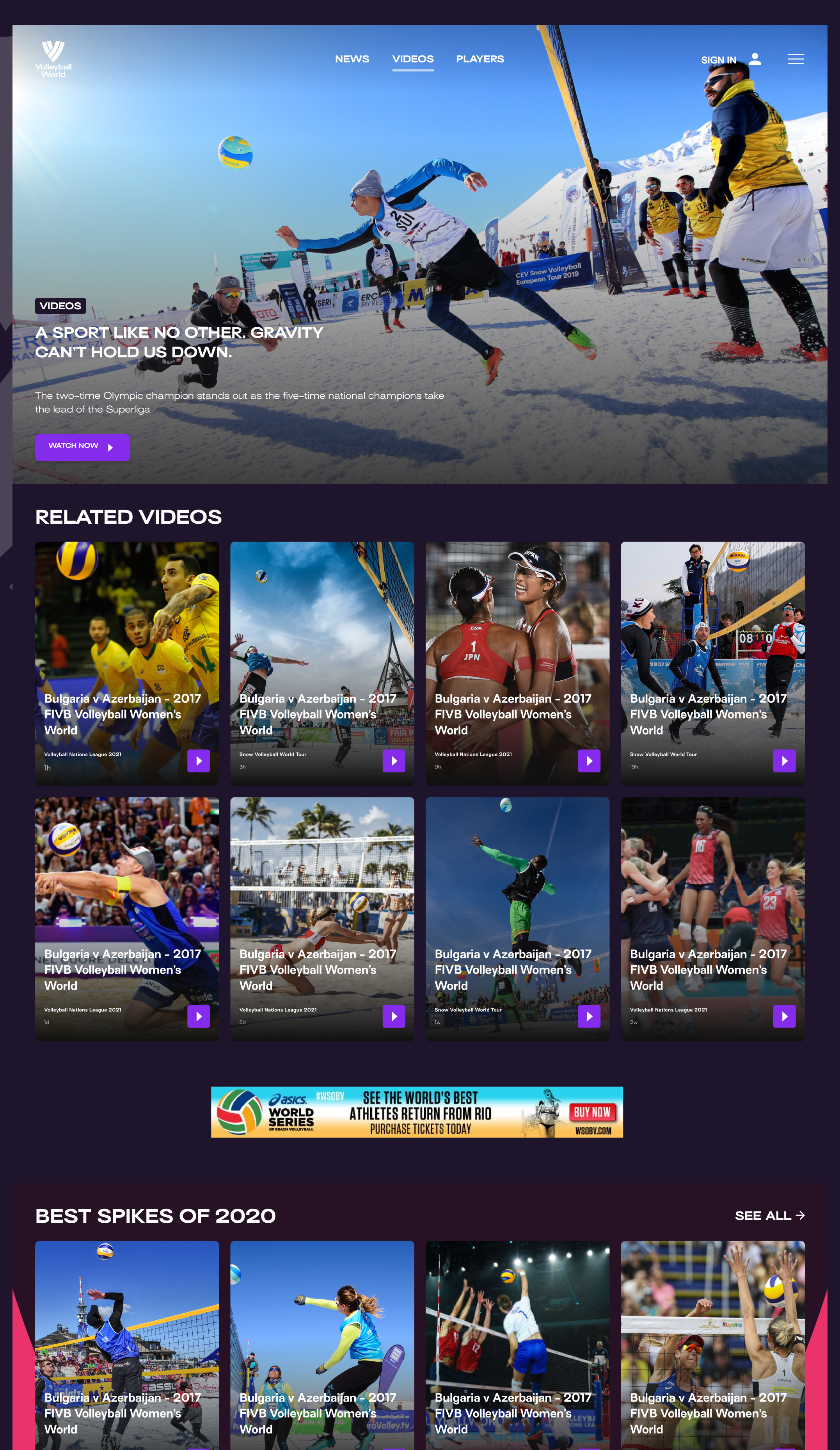
In our analytics review we found that users were primarily interested in tournament information, particularly the schedule and results section. We launched the MVP ahead of the Volleyball Nations League (VNL), while the schedule page for the VNL was the most visited page, it had an exit rate of 43%.

This highlighted a missed opportunity. How could we capture the attention of these fans and create a compelling onward journey to VBTV and increase paid sign-ups?

The first idea was to add a VBTV banner in the sidebar to promote the service, but this felt disconnected from the user’s intent. Visitors were on the schedule page for match information and would likely pay little attention to banners. We needed a more contextually relevant way to encourage sign-ups.
We explored integrating a call to action within each match card to provide a natural next step for users already engaging with fixtures and results.

After an internal design review, we decided a static link alone wasn’t compelling enough. The same CTA in match card felt redundant and became invisible, so we needed something more dynamic and in line with the match content within each card.
Each match card had a status - upcoming, live, or result, each with a different design treatment, so adapted our approach to align with this format
Upcoming matches - "Watch on VBTV"
Live matches - "Watch Live" - with added visual emphasis
Completed matches - "Watch Highlights"

This allowed us to create CTAs that felt relevant and actionable. By embedding these within the existing user flow, we provided a natural incentive to explore VBTV that added value.
Technical Constraints & Trade-offs
We wanted the CTA to link directly to each match, and for matches that weren't being shown for the CTA either be hidden or to have a separate status. However one of the technical challenges was that VBTV was a separate platform powered by Endeavour, and it didn’t communicate directly with our CMS, Forge. So there was no way of either confirming that a watch was available on VBTV or being able to link to directly to it, if it was being show.
To navigate this, we asked the client how many of the matches shown in the schedule would be available on VBTV. While they couldn’t guarantee that every match was always available, they assured us that most matches would be streamed.
We also had one eye on the future too. While we couldn't fetch match information from Endeavour now, if that ever changed we could quickly iterate and pull in live match links with little change. We also wanted to build a case for our own streaming product AXIS, which long-term we wanted Volleyball World to switch to when the time was right. If VBTV transitioned AXIS, we would also expand match cards to show data such as live match clips or highlights packages.
Schedule as a TV Guide
During some further data analysis, we discovered that a common onward journey from the schedule pages was back to the home page and then onward to VBTV. Our theory was that registered users were using the schedule page like a 'What's On' guide, which was something that VBTV lacked. The journey back to the home page to click the login link to VBTV felt unnecessary, so by providing CTAs to VBTV in the match cards we were shortening a common journey for registered users.
So although the user experience wasn't without trade-offs, we decided it was worth testing.
Key Challenge - Increasing VBTV Subscriptions
The Outcome
To benchmark the results, we could see that in the first 6 months that onward journeys from the VNL schedule page to VBTV were <1%, while exit rate was 43%. While the Volleyball Nations League was finished and wouldn’t return for another 6 months, we could also see that the global schedule page and the Beach Pro Tour schedules had similarly high exit rates around of 40% and 52% respectively, so we were looking to improve on there.
We had also seen that the number of users who did not exit on the VNL schedule page, 67% had an onward journey back to the homepage, and similar numbers of 58% and 65% for users who visited the global schedule page and the Beach Pro Tour schedules respectively.
We worked with the engineering team to add the contextual CTA to each match card and measured the results after 12 weeks.
The Results
Onward journeys to VBTV
Global Schedule increase from <1% to 32%
Beach Pro Tour increase from <1% to 24%
Schedule Pages Exit Rate
Global Schedule down from 40% to 23%
Beach Pro Tour down from 52% to 28%
Onward Journey to Home
Global Schedule down from 58% to 44%
Beach Pro Tour down from 65% to 58%
These results show that by adding contextual CTAs to match cards in the schedules we significantly increased the amount to traffic to VBTV. And by including a strong onward journey we also decreased the number of visitors leaving the site or simply returning home, which is often an indication that the user doesn't know where to go next.
Next Steps
By increasing the number of users to VBTV we had made a good start, next we had to look at the signup funnel to see what users were doing when they got to VBTV.
Key Challenge
Optimising the Funnel
So we had significantly increased the amount of users being directed to VBTV, the next consideration was what the journey looked like when they arrived and how we might be able to optimise it.
Key Challenge - Optimising the Funnel
The Solution
We began by mapping out journeys for both potential customers and existing customers

When mapping out these user journeys, we immediately made some observations
1. The link to VBTB took users to a sparse page with just a login button, which felt extremely unnecessary.

2. The login/register screen was an external Azure AD B2C page which was unbranded, aside from the background image. This lack of branding might have led the user to think they had left Volleyball World and gone to a different site (they had, but we didn’t want it to feel like that).

3. One the user was logged in, they could see what was available, but there was no information on subscription costs or available packages. Only when they clicked on an item to watch it did the system perform a subscription check.
4. Package selection - the user was given 2 choices of package, there was no persuasive messaging or design.

5. Once the user had registered, they were returned to the VBTV home page, not they item they had clicked on to watch
Login Confusion
We were also confused by the login. If were were logged into our Volleyball World account, we were still prompted to login when we tried to access VBTV, and our credentials wouldn’t work. We quickly discovered that even though the login pages looked the same, the Volleyball World and VBTV account sections were independent, meaning a user needed separate accounts for each.
User Testing
We felt like there were a host of improvements that could be made here, but we wanted to get some feedback from users too.
I headed out of the office to our nearby WeWork to spend an afternoon doing some guerrilla user testing. This would allow us to get direct feedback from users, validate our own assumptions, and shine a light on any other issues that we might have missed or dismissed.
I hired an informal meeting room with a screen and some sofas and headed to the cafe upstairs to find some users. I politely approached people who came over to the coffee bar for a break, asking if they could spare 15 minutes in exchange for a £10 Amazon voucher. As a screener I also asked them if they consumed sports content online and had at least one active subscription to a streaming service.

Test Structure
I ran 6 test sessions across the afternoon, 3 on a laptop testing the desktop sized signup journey, and 3 using a smartphone. I structured the tests as follows:
Short Opening Interview (Qualitative)
I began with a short informal interview, which helped build rapport and relax the user. We talked about what sports they watch and play, and which streaming services they regularly use.
Moderated Test
The user was asked to navigate to Volleyball World, then to sign up to a VBTV subscription service of their choice, stopping at the point where they had to enter their credit card details. I asked them to articulate what they were thinking and doing as much as possible, and recorded their voice and screen if they gave consent.
Exit Interview Survey (Quantitative)
After the test I asked the user for their thoughts on the journey, noting down useful quotes. I then asked them to fill out a short printed survey, scoring areas such as difficultly, quality, speed, and a Net Promoter score. These scores would allow us to benchmark future designs that we tested.
Key Findings
Back at the office, I edited an a highlight reel of key moments and compiled key quotes from the test videos, putting them into a deck ready to present to Volleyball World.
Our key findings included:
- Overall users felt the journey was long with many frustrating moments
- When taken to the Azure login/registration screen, some users clicked back because they believed they’d done something wrong. When asked why, they commented on the lack of branding, and that because the page looked different they “thought they had gone to the wrong place.”
- They felt frustrated by what felt like a double registration. After signing up for a VBTV account they expected to be able to start watching, and became frustrated when they browsed for something to watch, only to be sent to the package select screen. They felt like package selection should have been done as part of the registration process.
- Users were expressed annoyance at being asked to pay for something that initially appeared to be free. When registering for an account and browsing the content there had been no mention of cost. Only when they clicked on something to watch they were stopped and told they had to pay.
The results indicated that as part of a successful redesign, we should consider:
- Showing details of prices and subscription earlier in the funnel, using persuasive design and messaging
- Bring the package selection and registration together
- Offer some free content or a trial so that users could ‘try before they buy’.
So we pulled together the key findings from the user testing, along with our own observations, however before we presented these to Volleyball World we wanted to mock up a what we thought a target journey should look like, as well as changes to key screens.

An Optimised Journey
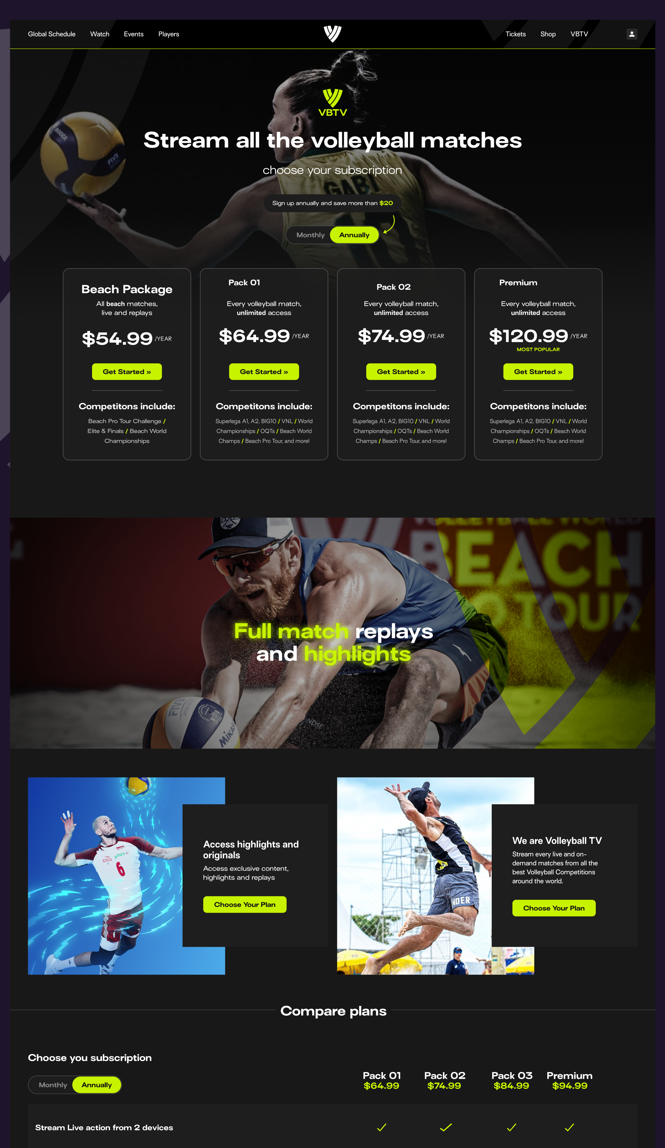
We felt we could significantly alter the user journey to a shorter number of steps. We wanted one login, and users who were signed in and had an active subscription should be able to go straight to VBTV and watch. For those who were logged out or were not subscribed, they would be directed to a landing page which showed package information, pricing and key features of the service.
Single Sign On
The proposed changes to the journey would require development effort and technical challenges, so before presenting to Volleyball World we had an internal call with our engineering team. It became clear that to achieve these changes, the Deltatre and Endeavour systems would need to work together. One key challenge we wanted to solve was the double registration, with registered Volleyball World users needing to sign up for a separate VBTV account. Because both systems were using Microsoft Azure AD B2C, it could be possible to implement a single-sign on (SSO) meaning that users only needed one account.
A New Landing Page
New and logged out users were directed to a new landing page, replacing the 'login button page'. This landing page would be optimised for conversion and would feature the following design elements:
- Removal of primary navigation and footer, with only links to select a subscription package or to login.
- Persuasive design and messaging
- Subscription package details and the differences between them
- Clear pricing upfont with promotional deals
- FAQ section to quickly answer queries that a potential customer might have, keeping them on the page

Landing Page V1
This first version of the landing page featured clear pricing and differences between the packages, but during the design review we agreed the messaging around the icons wasn't visible or persuasive.

Landing Page V2
This version had clearer and bolder elements promoting the key features, however we agreed that the page might benefit from more photography in place of the icons.

Landing Page V3
We experimented with a lighter colour scheme and added some photography around the features and added additional persuasive elements with CTAs further down the page. We proesented this version the client, and their feedback was that they preferred the darker colours and wanted the page to feel more exciting and less 'boxy'.

Landing Page V4
We reintroduced the darker colour scheme with lime CTAs. We added photography in the hero to bring it to life more, with a 12 second looping video element below. We also added a table of features for each package which could be expanded to show more packages in the future. We also added a FAQ section and the cards from the hero to the bottom of the page, so that there was a clear onward journey and symetrical flow to the page. This design was later signed off by the client and we produced variations for split testing.
Client Presentation
We were ready to present our findings to the client, and invited Endeavour to the call too. During the call we presented
- The current journey and highlighted some initial issues with the superfluous ‘login button’ screen, registration flow, and VBW credentials not working.
- The user testing highlight reel, and feedback scores
- Our optimised journey
- Landing page mockups
The group also agreed that SSO was necessary for users to avoid confusion and the need for multiple accounts, and from a back end perspective it made sense to have one source of truth for user details.
Key Challenge - Optimising the Funnel
The Outcome
Single Sign-On (SSO) Implementation
Engineering teams from Deltatre and Endeavour worked together to launch SSO, allowing users to register and log in with a one account instead of separate accounts for Volleyball World and VBTV. This significantly reduced confusion around logging in drop-offs in the journey.
Optimised User Journey
We significantly shortened the number steps required for a user to regitser and select a subscription package by combining the processes together into one. Further user testing showed that this revised user journey reduced the signup time from ~3 minutes to between 1 and 2 minutes on average.
Optimised Landing Page
This page combined registration with package selection on a single landing page. It also featured persuasive design techniques and messaging, and showed pricing early in the funnel, which the user testing showed us users expected to see.
In the first 12 weeks of testing, we benchmarked the following
Click-through rate: 6% - this was a good start but could be improved. Our target for 6 months was to a CTR of 10 - 15%.
Conversion rate: 1.2% up from 0.3%. We felt like this was a good improvement but were targeting between 2 and 3% for the first 6 months.
Overall revenue: Initially we saw an increase of 14%, with a target of 20% to 25% after 6 months. Considering how poor the previous sign up flow was, this may not seem like a large increase. However one of the things we had observed was that despite the challanges of the previous journey, fans persisted with it because 1. they wanted the content, and were prepared to fight to get it, and 2. the service had no real competitor. However over time as we saught to attract more casual fans to the service the signup flow would need to be as easy to complete as possible.
Selected Works