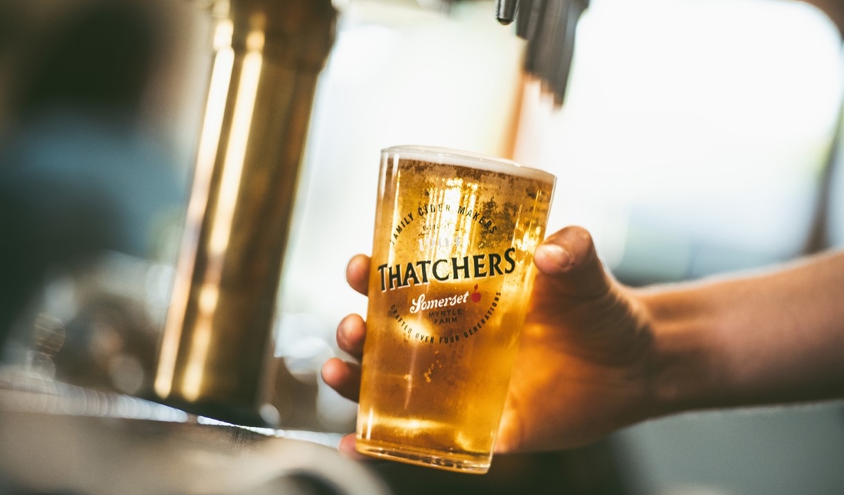
Thatchers Cider
Project Type - Website Design
Date of Completion - August 2016
Project Duration - 9 months
Key Challenges
Part of a high profile rebrand
Modular design system
Tight deadline
My Role
Strategy
UX Design
Design Lead
Aims and Objectives
Thatchers are a family cider makers with a rich history. Currently the second-largest cider brand in the UK, they’ve been growing apples and producing cider from their home in Somerset for over 100 years.
After a rebranding effort that covered both the company and a number of their product ranges, Thatchers needed a new website. They were keen to simplify and modernise their site, moving away from text-heavy pages to a more visual brand experience.
Method
They wanted a website that could support their expansion into new global markets. This meant support for regional text variations (English cider in the US is called hard cider, while in Australia Thatchers Gold would suggest a lower alcohol content) and multi-language support. They also needed an age verification feature on their website that recognised legal drinking ages in different countries.
They also needed to create landing pages to support future marketing efforts such as their annual Glastonbury sponsorship and other types of events.
Their old website used a proprietary CMS which was no longer being supported, so they wanted a new easy-to-use CMS which could support multiple languages as they expand into new global markets. They were keen to avoid another proprietary system, so it was important that the new CMS was built using open source technology and was well supported with regular updates.
I was responsible for a vision for the new website site and to oversee its creation. I lead a small team of a visual designer and Wordpress developer and worked closely with the Thatchers marketing team and branding agency.
Method
Thatchers have a rich history and their identity is rooted in their Somerset home, so I took the team to visit the farm. We met the staff and locals, took the factory tour and had dinner in the Thatchers pub. Understanding the culture and what it meant to the local area helped us to truly understand the nature of the assets we'd be creating.

Data Review
I began the project by doing a data review using Google Analytics, and Hotjar for heatmaps and session replays. While Thatchers already knew that the current website wasn't performing well, it was important to get an understanding of why and to see if there were any problems that hadn't been identified yet. This was critical as direct user research was out of scope.
Workshop
It was important to get input from key stakeholders, so the next stage of the project was to get together with the Thatchers and their branding agency for a 2-day collaborative workshop. I began by presenting the data review for discussion, which revealed some new objectives for the site.
We then ran audience and brand investigation exercises, exploring audience characteristics and creating draft personas. We explored tasks for each persona and created user journeys and a rough sitemap.

I ran a visual design exercise which helped me establish a visual design direction by understanding the group's design preferences, and what if anything we should avoid.
This exercise involved showing the group home pages from 20 different websites for 20 seconds each and asking them to score each one based on their gut feeling. I then added up the scores and we discussed the highest and lowest scoring websites. Visual design can be subjective even when brand guidelines exist, and this exercise allowed me to understand what the group collectively liked and dislike, which helped us avoid numerous rounds of visual treatments revisions later on.
At this point the website structure and look and feel has beginning to take shape, so I wanted to establish the information hierarchy on key pages. I asked them to individually sketch key pages of the website on paper, then present back to the group. While talking through their designs I added key elements to a list on the whiteboard, and as a group, we then discussed and agreed on which items should stay and removed the rest. This left me with a rough information hierarchy for wireframing.
To end the workshop session, we revisited the sitemap and discussed what content we already had, what needed editing and what needed to be written from scratch. Thatchers were going to be providing the content, however, they needed help with a photography brief which I created after the session.
Design Systems
One of the issues we were now facing was the need to start wireframing without having any of the revised copy. The deadline didn’t allow us to wait for Thatchers to write their content, so the challenge was to a create a design system of reusable modular elements that could be populated with text and images nearer to launch.
We'd established that Thatchers wanted to reduce the amount of text on their website in favour of a more visual experience, however, some pages would simply need to contain a lot of text, so I decided to create two design systems, suitable for long and short-form content.

Wireframes
It was important to make sure that the modules in the design systems worked as pages, so I road-tested them by arranging the paper prototype elements into page layouts using the information hierarchy we created in the workshop. This would also give Thatchers a visual guide to how much copy they might create for each part of the website. After some small adjustments, we were ready to present our work so far to the Thatchers stakeholders.

Prototype
To present to the Thatchers stakeholders I used InVision to turn the high fidelity wireframes into a prototype website. This allowed them to experience the wireframes look and feel in a website format - on screen and in a browser, which made the wireframes look and feel like a real website.

Design and Development
Once we had gone through a round of amends to the design systems and wireframes, the visual designer and Wordpress developer added the visual layer and coded the website. I was involved during these phases, working closely to give direction on visual styling and questions that would arise during the development. We held regular progress update sessions, discussing issues that arose and keeping stakeholders involved when necessary.
The Result
The Thatchers website was launched in the summer of 2016. 3 months after launch analytics showed a 15% increase in new sessions and 43% reduction in bounce rate across all devices. Sales on the e-commerce platform increased over 300% in the first 12 months, generating 2 new jobs at the company.
Selected Works