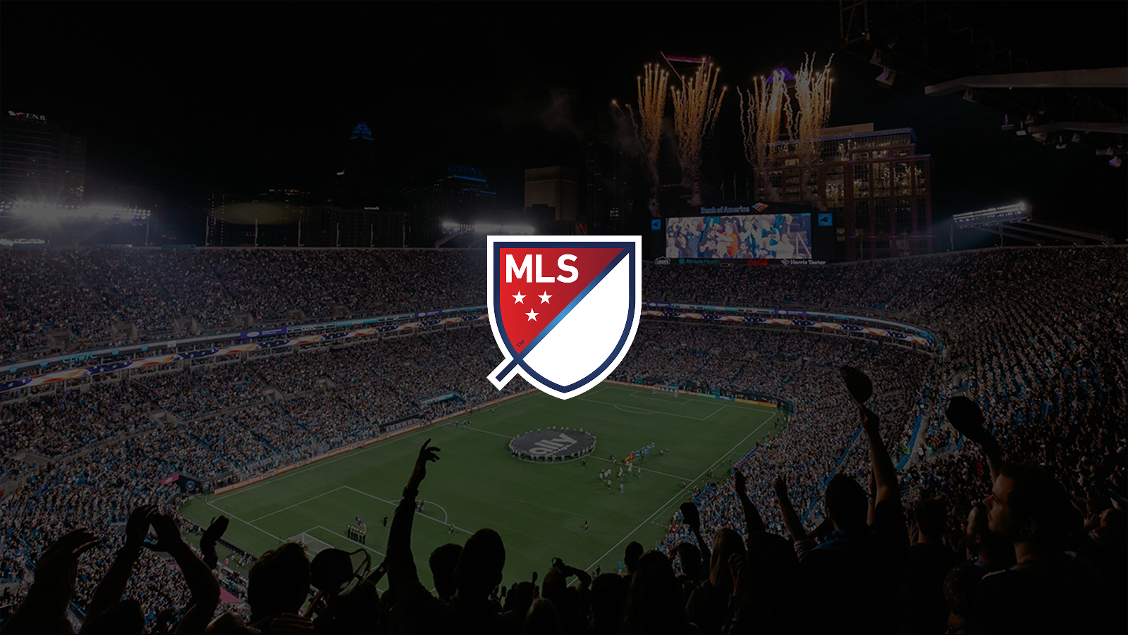
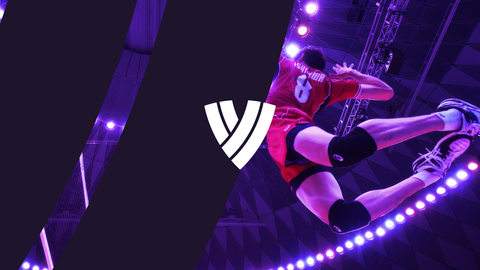
Volleyball World
Project Type - New website and app launch
MVP Launch - March 2022
Project Duration - 3+ years
A new fan-facing brand for one of the world's most popular sports
Challenges
Merging a large number of competition microsites into a standard format
Integration of complex data platform
Capture signups for Fan Passport
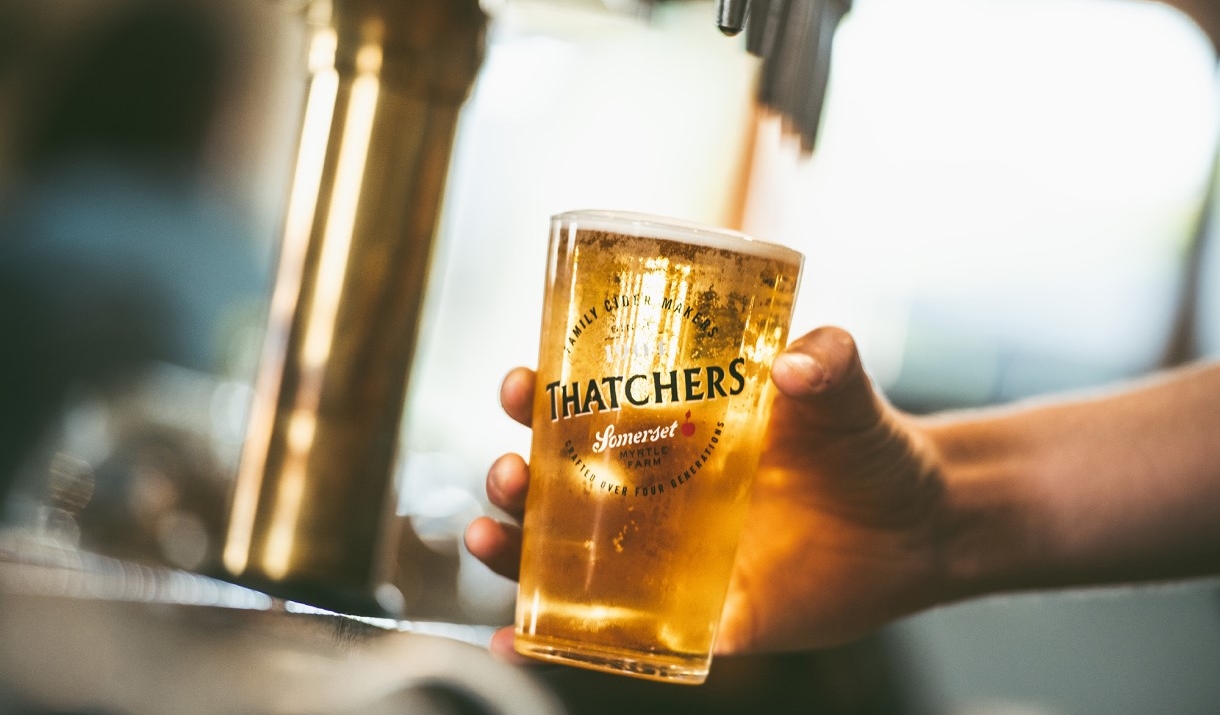
Promote Volleyball TV streaming service
Hyper aggressive timescale for MVP launch
My Role
Design Lead
I was responsible for the overall design vision, planning and delivery. I managed the design team remotely across Europe and Australia, produced the UX design assets, facilitated workshops, lead reviews with designers. tech teams, and stakeholders.
Aims & Objectives
Volleyball is one of the most popular sports in the world, with an estimated 900 million fans across Brazil, USA, Russia, Italy, Japan and China and more. The professional game’s governing body is the FIVB who oversee leagues and tournaments across 3 disciplines - indoor, beach and snow volleyball.
The FIVB web property was suffering from an identity crisis - presenting a mix of rules and board meeting minutes alongside fixtures, results, and news. It wasn’t attractive for fans and didn’t inspire new players to get into the game. Tournament and Leagues all had their own microsites with varying IA and design patterns.
They hired Deltatre to create web and app properties for Volleyball World, with the aim to do the following
- Bring all tournament and league data back into one place.
- Offer users a personalised experience by signing up for it fan passport, which would make the site more attractive to advertisers as it collects data from its global fanbases.
- Promote and capture fan signups for Volleyball TV streaming service.
- Beat their competitors to become the source of truth for stats, rankings, scheduling, and athlete data
Method
MVP Launch
We began the build phase with a discovery workshop where I ran a design kick-off and requirements gathering session. After the session I broke the requirements into tasks and sprints in a delivery plan. I spent some time auditing the content of the existing web properties and created a top level sitemap which broke the sections into phases from MVP to phase 3.
Because we were facing an aggressive timescale, we would be creating UX and UI assets in tandem, with wireframes one week ahead of UI. This delivery plan was shared with the team and signed off by the client.
A Focus on Tournaments
The first task was for us to create an information architecture for the tournament sections. Moving forward tournament sites would all be on Volleyball World, but they needed a consistent structure and templates that would be skinned with different tournament branding.
In order to produce a consistent structure for tournaments moving forward, I audited a selection of existing tournament sites, including major ones across the 3 disciplines, and minor ones too, so that I got varying range of content types and amounts.
From there I produced a tournament sitemap proposal with sections which were marked as required or optional, which allowed for flexibility between different types of tournaments. For example, in Beach Volleyball the resort is a key part of the experience, but for Indoor Volleyball it’s not needed. I also created a set of navigation concepts, which used navigation patterns such as priority plus, mega menus and off canvas panels.
Volleyball World would launch ahead of their largest annual tournament the Volleyball Nations League, so we created these assets using the VNL branding. In order to communicate the design vision we skinned the key modules and mocked up selected key pages. These designs would needed to be skinned for future tournaments, so we produced a style guide, detailing the following
- Colour palette
- Typography ladder
- Buttons, dropdowns, icons
- Grid and spacing tokens
- Logos
- Branded backgrounds
We then tested this with the branding from a past tournament, making some adjustments. We also produced a skinning guide, which showed annotated modules and how to apply tournament branding to them. Once the VNL assets were reviewed and signed off, we moved on to producing the rest of the web assets.
Key Challenge - Development Efficiency
The designs needed to be delivered quickly but the development teams needed to build quickly too, so I had regular review sessions with the tech lead on how to design for build efficiency. Our CMS, Forge, had a built in module library and it was decided that we would add a design layer on top of these with as little customisation as possible. However this soon caused some friction with the client, who wanted to see more creative ideas regardless of timescale. We had to strike a balance of creativity and efficiency where we would launch the skinned modules for MVP launch, but we were also mocking more creative ideas that could be revisited post-MVP.
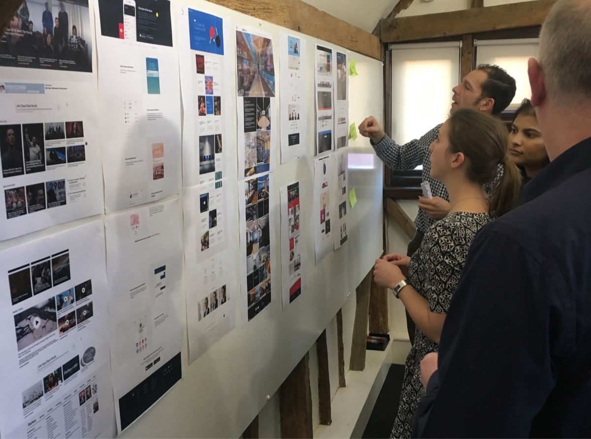
Design handover was also a challenge as the number of designs assets quickly grew. We organised a kind of Kanban board inside Figma where new designs could be added for client feedback, with lanes for in review, amends applied, and client approved. This quickly grew and began difficult to navigate, so after a rethink we created a master list of all assets within Confluence with Figma links and status labels applied.
As we began reviewing the staging build for design feedback, we noticed that when users attempted to log in or register for their Fan Passport account, they were redirected off-site to an unbranded Microsoft Azure login page. The form fields also differed significantly from our designs.
Discussions with the development team proved frustrating, as they indicated that customisation options were extremely limited—fields could only be hidden, not added or modified.
Since a key objective of the website was to drive sign-ups, this unbranded experience was negatively impacting our ability to maximise registrations. Finding a way to improve the design became a priority.
I have a good knowledge of HTML and CSS, so began to inspect the code behind the pages to see what was possible. I quickly saw that there were a number of hidden form fields, and some of them were what we wanted to include from our designs. I also used the the existing classes to write some CSS that styled the forms to be close to our original designs. I arranged a call with the developers to discuss this with them, and sent them the code I’d written. They then optimised the code and included it in the build.
The Volleyball World App
During the initial kick-off the requirements gathering session the client had requested that we park the app and come back to it. When we did revisit it, it became clear that there wasn’t a clear strategy or vision beyond wrapping the website inside an app. In our experience that strategy doesn’t always attract users and will result in poor retention rates. It was crucial that if we were going to have an app it would have a clear use case, so we decided to hold a 2 day workshop with the client to make some decisions and get a clear direction.
We arrived at the workshop in Switzerland with 3 design mocks for discussion, and brought a diverse team including the tech lead and PO, who would have vital input on discussions to make sure that ideas were not just desirable, but feasible and viable too.
We kicked off the session by presenting a review of what makes a good app. We also showed some examples of successful apps we had worked on in the past, including the Juventus Stadium experience, the DP World Tour app along with 3rd party examples. After lunch we spent some time as a group presenting our favourite in-category and out-of-category apps. We discussed what we liked about them and what we didn’t like too. I compiled notes on everything we thought made for a good app and what didn’t, and shared these on the screen for discussion before wrapping up.
It was key that the app was focused on user needs, so on the morning of the 2nd day I split the team into groups to work on some personas and their jobs to be done. Once we had established some use cases, we looked at how we could address them, referring back to the features and design patterns that we had compiled on the previous day. After lunch the groups began to wireframe some concepts before presenting them to each other. As a group we discussed and critiqued the concepts before wrapping up. After the workshop I developed the concepts further and presented them to the stakeholders, and as a group we decided to move forward with one.
The group chose a second screen experience app for Volleyball fans watching a tournament on the TV streaming channel Volleyball TV. The key features would be the ability to view live match and player stats in a match centre, hop between matches and viewing video clips of key moments.
The app also retained the key requirement of the web platform, which was to promote signups for the fan passport. We identified that the onboarding process was a key opportunity to do this, so we spent time making this both attractive and easy to use.
During the onboarding process, users could select their favourite disciplines, teams, and athletes, leading to a personalised experience. Even if they opted not to enter their email to create an account, their preferences would be saved on their device and they would have the option to complete their account at a later date.
The Result
Coming soon
Selected Works